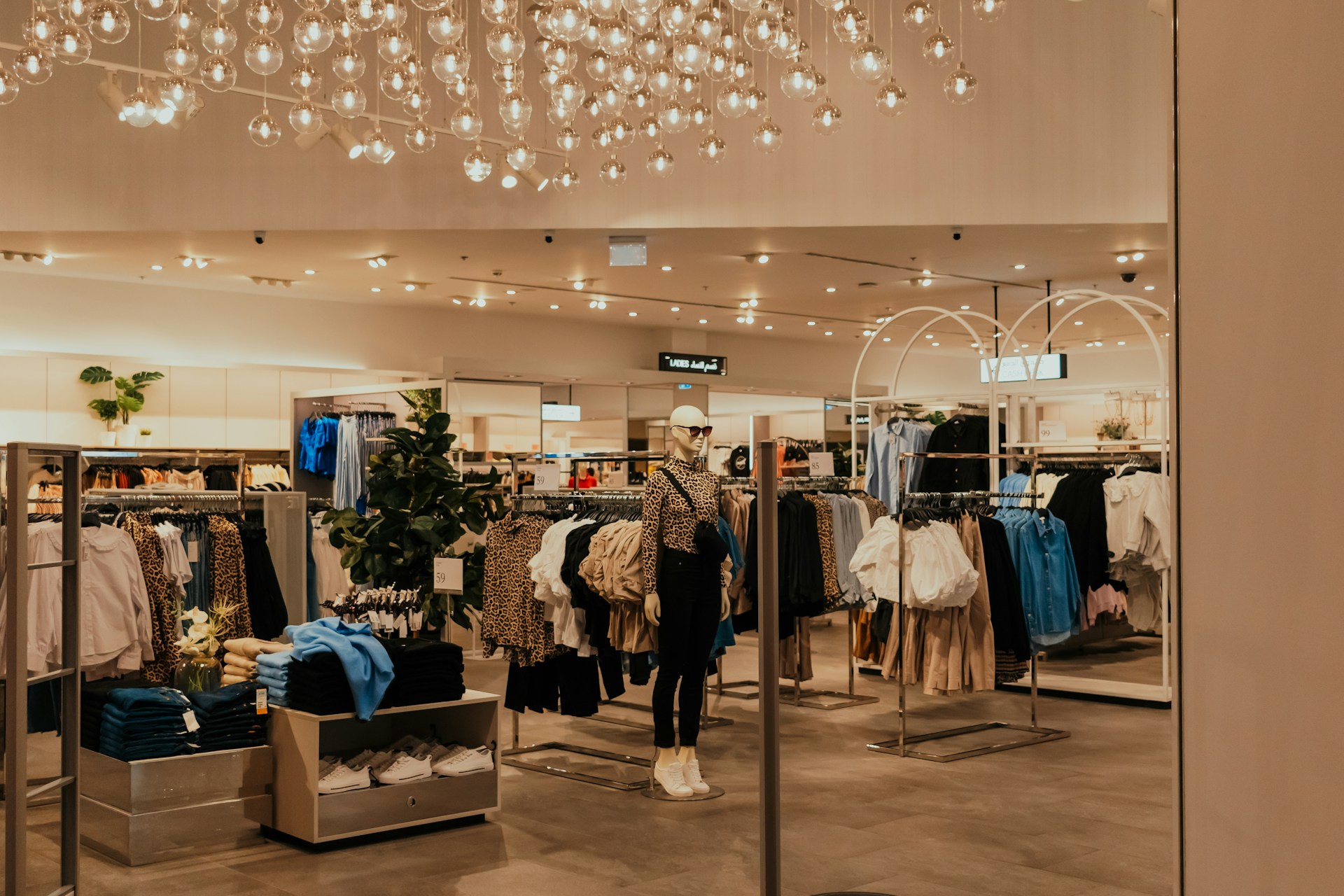
Retail store layout determines how shoppers move through your space and interact with merchandise. Research shows that 74% of consumers believe stores should prioritize engaging experiences, while 79% agree shopping should be multisensory.
When we design retail spaces, layout choices directly influence customer behavior and sales performance. Strategic arrangement of aisles, fixtures, and displays guides movement patterns while improving product visibility and encouraging impulse purchases. We coordinate infrastructure elements like lighting, security systems, and checkout placement to create seamless traffic flow that transforms browsing into buying decisions.
Which Retail Store Layout Types Work Best And When?
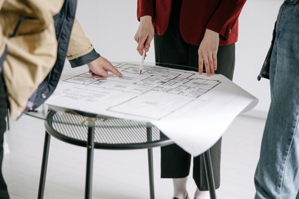
We evaluate layout options against three key criteria: space requirements, product assortment, and operational goals. Each layout serves distinct retail missions and spatial constraints.
The grid layout organizes parallel aisles to maximize product density while providing familiar navigation patterns. Grocery stores and pharmacies rely on this proven approach because customers expect systematic organization when shopping for essentials. However, without strategic focal points like end-caps or feature displays, grid layouts can feel sterile and generic. We recommend this layout when floor space exceeds 3,000 square feet and inventory includes hundreds of SKUs across multiple categories.
Loop or racetrack layouts create defined customer paths that drive exploration and impulse purchases. IKEA demonstrates this concept effectively by guiding shoppers through curated room displays before reaching checkout. The controlled flow exposes customers to merchandise they might otherwise miss, but congestion becomes problematic during peak hours. We implement loop layouts for furniture stores, department stores, and experiential retail concepts where browsing time directly correlates with sales volume.
Free-flow layouts prioritize open, flexible browsing experiences that encourage discovery. High-end boutiques and lifestyle brands favor this approach because it allows customers to explore at their own pace without feeling rushed or constrained. However, poor wayfinding can frustrate shoppers seeking specific items, and maintaining visual coherence requires constant attention. We design free-flow spaces for stores under 2,000 square feet with curated assortments and strong brand identities.
Herringbone layouts angle aisles to maximize efficiency in long, narrow spaces. Independent bookstores and small hardware retailers use this configuration to pack maximum inventory into challenging footprints. While space-efficient, angled aisles create sightline challenges that increase theft risk and complicate security camera placement. We recommend herringbone layouts for spaces with width-to-length ratios exceeding 1:3.
Spine or straight layouts feature central aisles that link distinct product zones. This cost-effective approach works well for markets and department stores that need clear navigation between categories. The main spine ensures customers see featured merchandise, but front and side areas often get overlooked without strategic product placement. We use spine layouts when budget constraints limit fixture investment but clear zoning remains essential.
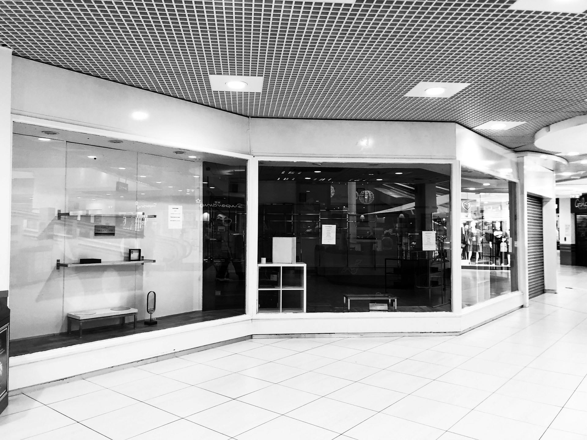
Diagonal layouts position angled aisles to expose more merchandise while guiding shoppers toward checkout areas. This variation on the grid layout improves product visibility and creates dynamic sightlines throughout the space. However, diagonal configurations can narrow aisle widths and complicate restocking procedures. We implement diagonal layouts in spaces where maximizing product exposure within limited square footage drives profitability.
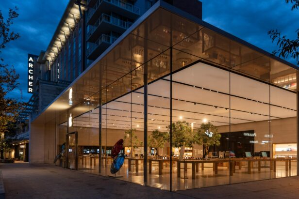
Angular or curved layouts incorporate rounded fixtures and flowing lines to create premium shopping environments. Luxury retailers use curved displays and organic shapes to differentiate their spaces from standard retail boxes. This approach requires careful planning to avoid wasted corner spaces and higher fixture costs. We design angular layouts for brands positioning themselves as premium experiences rather than commodity retailers.
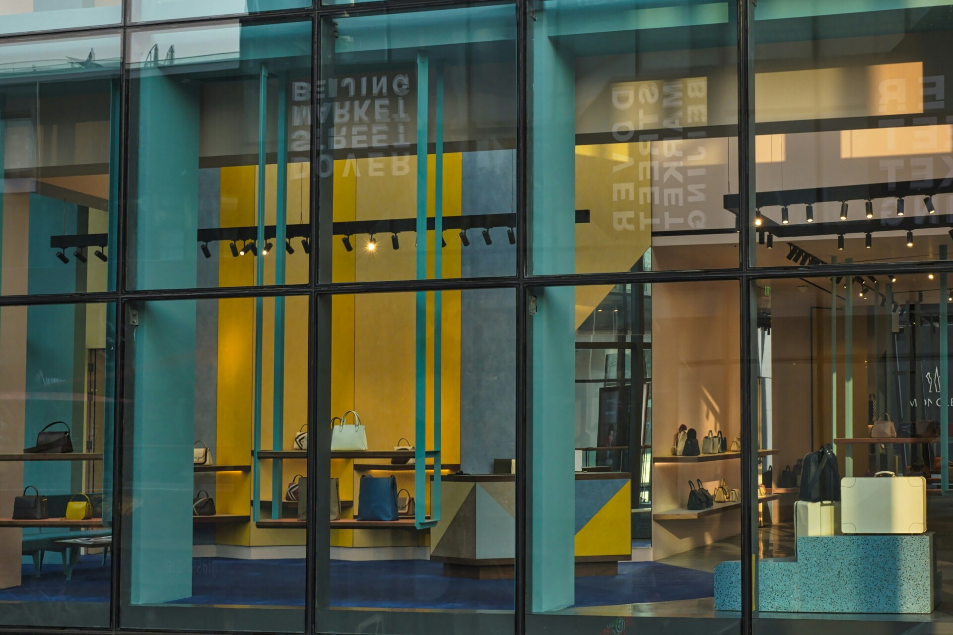
Geometric layouts employ bold shapes and patterns to define product zones and reinforce brand identity. Fashion retailers targeting younger demographics often choose geometric configurations to create Instagram-worthy spaces that encourage social sharing. The challenge lies in balancing creative expression with functional clarity for staff and customers. We recommend geometric layouts for concept stores and brands where visual impact drives foot traffic.
Boutique or alcove layouts create shop-in-shop environments that separate product categories or brands into distinct zones. Department stores use this approach to give each brand dedicated space while maintaining overall store coherence. Over-segmentation can reduce cross-shopping opportunities and create dead zones during off-peak hours. We design alcove layouts for multi-brand retailers with established customer loyalty to specific labels.
Mixed layouts combine elements from multiple configurations to address unique operational requirements. Large retailers often use loop perimeters with grid centers, or spine layouts with free-flow departments. This hybrid approach maximizes flexibility but requires sophisticated planning to ensure smooth transitions between layout types. We implement mixed layouts for stores exceeding 10,000 square feet where different departments serve distinct shopping missions.
| Layout Type | Space Requirements | Best Applications | Key Considerations |
|---|---|---|---|
| Grid Layout | Over 3,000 sq ft | Grocery stores, pharmacies | Can feel sterile without focal points |
| Loop Layout | Large spaces | Furniture stores, department stores | Congestion during peak hours |
| Free-Flow Layout | Under 2,000 sq ft | High-end boutiques | Needs strong visual coherence |
| Herringbone Layout | Narrow spaces | Independent bookstores, hardware retailers | Increased theft risk |
| Spine Layout | Wide central aisle | Markets, department stores | Front and side areas overlooked |
| Diagonal Layout | Limited floor space | Retailers seeking visual dynamics | Narrows aisles |
| Angular Layout | Varied shapes | Luxury retailers | Higher fixture costs |
| Geometric Layout | Creative spaces | Fashion retailers | Balancing creativity and clarity |
| Boutique Layout | Distinct zones | Department stores | Can reduce cross-shopping opportunities |
| Mixed Layout | Exceeds 10,000 sq ft | Large retailers with diverse departments | Requires sophisticated planning |
How Do Customer Flow, Zones, And Checkout Design Impact Conversion?
Customer behavior patterns drive successful retail construction. Research shows that 90% of Americans instinctively turn right upon entering a store, making this prime real estate for high-margin products. We design our retail builds around this natural movement, creating decompression zones that allow shoppers to adjust without overwhelming them with immediate product placement.
The decompression zone spans the first five to fifteen feet inside the entrance. We keep this area uncluttered during construction planning, avoiding critical merchandise displays that customers typically overlook while transitioning from the outside environment. Instead, we position the power wall just beyond this zone where customers naturally focus after their initial adjustment period.
Strategic Store Zoning For Traffic Management
We divide retail spaces into distinct zones that serve different functions and traffic patterns. High-demand zones naturally pull customer traffic and require robust structural support for heavy foot traffic and frequent restocking. These areas typically house everyday essentials or destination categories that drive store visits.
Low-demand zones present construction challenges that we solve through guided pathways and strategic end-cap placement. We install fixtures and sightlines that naturally direct customers toward these areas, preventing dead zones that hurt overall store performance. Our approach involves creating visual anchors and clear navigation cues during the build process.
We also identify idling zones where customers naturally pause or gather. These high-dwell areas work well for impulse categories or seasonal displays. Flex zones accommodate merchandise changes throughout the year, requiring modular fixture systems and flexible electrical layouts that we coordinate during initial construction.
Checkout Placement And Queue Design
Checkout location follows the logical conclusion of the customer journey. We position checkout areas where the counterclockwise flow naturally terminates, often on the left side of the store for optimal traffic patterns. Visibility remains crucial for both loss prevention and customer convenience.
Queue design incorporates impulse merchandising opportunities while maintaining smooth flow. We build adequate space for product displays within queue areas, ensuring customers have purchasing options during wait times. Strategic fixture placement and electrical positioning support these impulse zones during construction.
Our builds avoid dead-end configurations that trap customers or create confusion. We maintain four-foot aisle widths as the standard for accessibility and comfort, ensuring wheelchairs and shopping carts move freely throughout the space. This width prevents the discomfort that occurs when customers feel crowded or brushed against, which research identifies as a significant deterrent to browsing and purchasing.
What Merchandising And Fixture Tactics Lift Average Order Value (AOV)?

Effective merchandising and fixture placement directly influence purchase decisions and spending patterns. We use proven tactics that encourage customers to add more items to their transactions, increasing the total value of each sale.
Cross-Merchandising For Higher Transaction Values
Cross-merchandising groups complementary items together to prompt add-on sales. When we position related products near each other, customers discover items they might not have considered separately. A hardware display featuring drill bits alongside power tools or paint brushes next to primer creates natural purchase combinations.
This approach works because it mirrors how customers actually use products. We place items that solve related problems or enhance each other’s functionality in close proximity. The key lies in understanding product relationships and customer workflows to create logical groupings that feel helpful rather than pushy.
Speed Bumps To Slow And Engage Shoppers
Speed bumps are eye-catching displays positioned along main paths to interrupt customer flow and encourage browsing. We strategically place these attention-grabbing elements to break up monotonous aisle layouts and draw focus to specific products or categories.
These displays can include interactive elements, seasonal vignettes, or prominent product demonstrations. By slowing foot traffic at key decision points, speed bumps give customers time to notice and consider additional purchases they might otherwise overlook during quick shopping trips.
Clear Sightlines For Product Discovery
Maintaining clear sightlines ensures priority categories and promotional signage remain visible from store entries and power aisles. We design fixture heights and placement to avoid visual barriers that hide important merchandise or directional cues.
Clear sightlines help customers navigate efficiently while exposing them to more product options. When shoppers can see deeper into the store and identify different departments, they’re more likely to explore beyond their initial shopping list and discover additional items worth purchasing.
Strategic Fixture Selection For Specific Goals
Different fixture types serve distinct merchandising purposes and support varying AOV strategies. Gondola displays maximize product capacity while enabling cross-sell opportunities through adjacency. Window displays attract initial attention and communicate brand messaging from outside the store.
POP displays provide guidance and education about specific products, helping customers understand value propositions. Display cases protect and elevate high-value items while creating perceived premium positioning. End-caps spotlight featured categories in high-traffic locations where they capture maximum attention.
Pegboards and gridwalls efficiently display small goods while maximizing vertical space utilization. Platform units and nesting tables create flexible foundations for seasonal and promotional vignettes that can be reconfigured as needs change.
Product Mapping And Planograms For Consistency
Product mapping provides the strategic framework for where categories and individual items should be positioned throughout the store. This high-level approach guides fixture placement decisions and ensures logical product flow that supports customer shopping patterns.
Planograms translate product mapping strategies into detailed, shelf-level execution plans. These visual diagrams specify exactly where each SKU should be placed, maintaining consistency across multiple locations and enabling measurable performance tracking. When we implement planograms consistently, we can analyze which product positions and combinations generate the highest sales and adjust accordingly.
How Can Data, Testing, And Flexibility Keep Layouts Performing?
Layout optimization requires constant monitoring and adjustment rather than a set-it-and-forget-it approach. We rely on data-driven feedback loops to understand how customers actually move through spaces, not just how we designed them to flow.
Video analytics form the backbone of our monitoring strategy. Heatmaps show where customers naturally gather, while pathmaps reveal the actual routes people take through the store. This technology identifies dead zones that receive minimal foot traffic and bottlenecks where customers get stuck or frustrated.
Tracking Customer Movement And Behavior
Dwell time measurements tell us which departments hold customer attention and which areas they pass through quickly. We pair this footfall data with POS analytics to calculate conversion rates by specific areas, revealing which zones generate sales versus those that simply attract browsers.
Queue analysis shows where customers wait longest and helps identify opportunities for impulse merchandising or process improvements. When we track average time spent in checkout areas alongside transaction data, patterns emerge that guide both staffing decisions and layout adjustments.
A/B Testing For Layout Refinement
A/B testing allows us to validate layout changes before rolling them out broadly. We might test different display designs in comparable store locations or experiment with aisle configurations during specific time periods to measure impact on traffic flow and sales performance.
Display arrangement tests can reveal whether moving high-demand products to quieter areas successfully redistributes traffic or whether customers simply bypass these zones entirely. Testing promotional placement against control groups provides concrete evidence for merchandising decisions.
Adapting To Changing Customer Missions
BOPIS and pickup services require dedicated space near store entrances to support repeat usage and customer convenience. We design these areas to be highly visible and accessible while maintaining security and inventory control.
Flexible display systems with movable fixtures allow for seasonal reconfiguration without major construction work. Clear, changeable signage helps customers navigate these layout shifts while maintaining the shopping experience quality.
Regular display refreshes maintain visual interest and prevent the space from feeling stale. This systematic approach to change keeps customers engaged while providing opportunities to test new merchandising concepts.
Building In Safety And Compliance
We maintain clear sightlines throughout the store for both customer service and loss prevention purposes. Camera views remain unobstructed to support security monitoring, and exit paths stay clearly defined for emergency situations.
Accessibility requirements shape every layout decision, ensuring aisles accommodate wheelchairs and mobility devices while maintaining adequate turning space and approach angles. These design standards create inclusive shopping environments that serve all customers effectively.
Conclusion and Next Steps
We approach retail store layout design as a systematic process that begins with fundamentals and builds toward performance optimization. Start with a base layout that aligns with your space dimensions, product assortment, and operational requirements. Map your zones and checkout placement early in the construction process to establish the framework for efficient customer movement and sales conversion.
Set your sightlines, aisle widths, and fixture standards during the initial design phase. We recommend minimum four-foot aisles for accessibility compliance and customer comfort. Use product mapping and planograms to maintain execution consistency across your retail footprint. These tools ensure your merchandising strategy translates effectively from concept to construction to daily operations.
Measure traffic flow, dwell time, and sales performance by area once your store opens. A/B test layout modifications systematically to identify what drives results for your specific customer base. Keep your design flexible through movable displays and adaptable signage systems that accommodate seasonal shifts and emerging shopper missions like BOPIS pickup. Build safety, loss prevention, and accessibility considerations into your foundation from day one.
With these construction-focused steps, your retail store layout and design strategy will systematically increase sales while delivering the improved in-store experience that drives customer loyalty. Contact EB3 Construction to discuss how we can bring your retail layout vision to life through expert construction execution.
